
Before we began designing the Bone Renewal Blueprint website, we needed to take another look at the brand.
The client had a clear vision for sharing her knowledge of bone health. Our job was to bring that vision into a website where people could explore her resources, purchase her eBooks, and learn about working with her.
As we reviewed her materials and researched her audience, we saw a reason to pause. The visual branding she had supplied did not feel aligned with the people she wanted to reach.
A website for sharing her knowledge
Bone health was the client’s passion, and she planned to focus on it after retirement. She already shared free resources through social media and had an established Instagram following.
She wanted a website to bring her work together, including an eBook series, helpful videos, and one on one consulting. The project goal was to have the website ready within a month after her retirement.
During onboarding, she provided her logo, content requirements, personal photographs, and videos. Those materials helped us understand what the website needed to do and how she wanted to share her knowledge.
Taking another look at the brand
The supplied logo featured a barbell, with a black and gold color scheme. We felt that combination suggested a gym.
Our audience research pointed toward a different direction. The people she wanted to reach were primarily women over 50, and her work had an educational focus.
A barbell was relevant to the subject, but the overall visual impression needed more consideration. We wanted the brand to support the way she approached her audience and the resources she offered.
We asked whether she would be open to exploring a new visual direction. She agreed.
That conversation gave us room to resolve the branding before carrying it through the website.
Using a brand board to make the direction clear
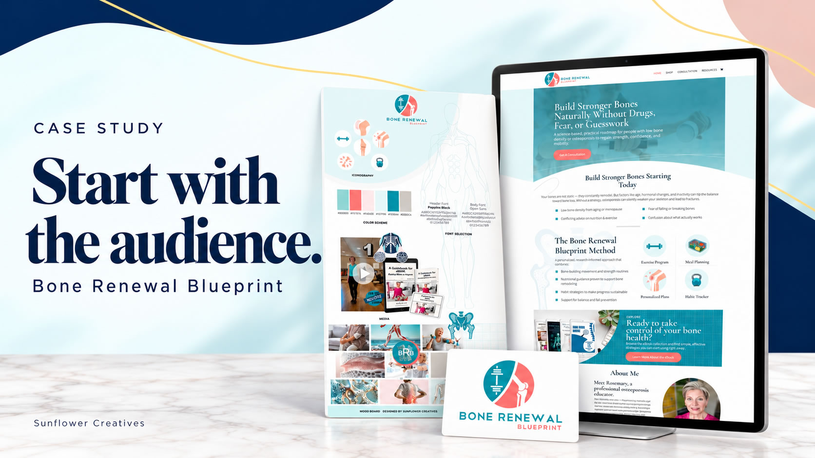
Our team researched a new palette and designed a new logo. We brought those elements together in a brand board that included typography, customized graphics, and repeated design elements.
The teal and coral palette gave the project a different visual direction while keeping a connection to bone health and fitness.
The brand board let the client see how the pieces would work together. She could review the logo alongside the colors, graphics, and supporting imagery before we applied them throughout the website.
She loved the direction and approved it.
That approval gave us a clear foundation for the website design.
Bringing resources and purchases together
With the visual direction established, we built the website around the ways people could engage with her work.
The website included:
- A WooCommerce store for her eBook series.
- A resources page with helpful videos.
- A separate affiliate shop with supporting products for bone health and fitness.
- A path to learn about her one on one consulting.
Her personal photographs and videos brought her presence into the website. The approved brand elements gave the pages a consistent visual foundation.
Each part had a practical purpose. Visitors could explore free resources, purchase an eBook, browse the affiliate shop, or consider consulting. Bringing those options into one website supported the different ways she wanted to share her knowledge.
What happened after launch
The website was completed, and sales began coming in immediately after launch.
The client already had an established Instagram following. That is an important part of the story. The website gave her existing audience a place to explore her resources and make purchases.
Why the early decision mattered
For us, this project shows why understanding the audience belongs near the beginning of a website project.
The branding decision influenced the colors, graphics, imagery, and overall presentation of the site. Taking time to review it gave the client a visual direction she approved before we built the pages around it.
It also reflects how we approach our work at Sunflower Creatives. We consider how the brand, content, resources, and purchasing process will work together around the website.
Explore the Bone Renewal Blueprint case study, including the original and new logos, approved brand board, and full homepage layout.




0 Comments